Guide · comparison
DTF vs screen printing at live events
We run both methods, so this isn't a sales page for either. It's the decision framework we walk planners through on the first call.
The five-second summary
Choose DTF when you need full-color artwork, mixed garment types, predictable line speed, or a clean venue-friendly setup. Choose live screen printing when the printing itself is the performance and your artwork is bold, one-or-two-color graphic design. Both end with a guest wearing something they watched get made — the difference is what happens between.
Where DTF pulls ahead
- Color has no meter. A DTF transfer with 40 colors presses in the same ten seconds as one color. Gradients, photographs, and sponsor logo walls are free complexity.
- Every print is identical. Transfers are produced and inspected before the event; shirt #400 matches shirt #1. Screens live-printed on site drift as ink loads change and squeegee arms tire.
- Garment flexibility mid-line. Tee, hoodie, tote, poly jersey — the press settings barely move. A screen setup tuned for tees hesitates when someone hands over a tri-blend hoodie.
- Venue paperwork is boring (good). No inks, solvents, or flash-cure units on site. Hotels say yes faster.
Where screens still win
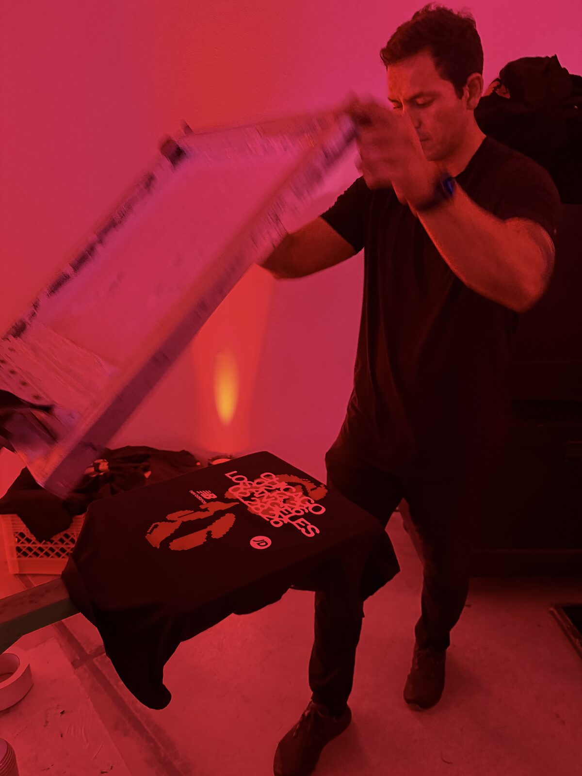
Honesty time. A manual press with a flooded screen and a confident pull is theater — the squeegee stroke is hypnotic in a way a clamshell press isn't. For streetwear-coded audiences, craft markets, and brands whose identity is bold spot-color graphics, we'll recommend live screens ourselves. The tradeoffs: one to two colors realistically, slower and more variable line speed, more setup and cleanup, and artwork locked weeks earlier.
The hybrid nobody tells you about
Plenty of our events run both: a screen station pulling one hero graphic as the spectacle, with a DTF press beside it clearing the volume and the full-color designs. The screen draws the crowd; the DTF line serves it. If your budget only supports one station, our default recommendation for expos, conferences, and corporate events is DTF — throughput and consistency win in rooms where people's time is scheduled.
What each method asks of your designer
The choice lands on your creative team's desk before it lands on the event floor. For screens, the file has to be reduced to flat spot colors — every gradient becomes a halftone decision, every color adds a screen, and the artwork locks two-plus weeks out because frames get burned and registered in advance. For DTF, we want the artwork at full resolution — 300dpi PNG with a transparent background, or vector — and that's the whole spec sheet. Drop shadows, photography, twelve-color gradients: the file the designer already made is usually the file we print. That difference in prep friction is invisible on event day but very visible in the three weeks before it, especially when a sponsor's logo arrives late and DTF just adds it to the next film run.
Where the money goes in each quote
Read the two quotes side by side and the structure tells the story. A live screen quote front-loads setup: art separation, screens burned per color, press calibration — costs that exist whether you print 40 shirts or 400, which is why screens reward one design at volume. A DTF quote shifts that weight into per-piece film production, so ten designs cost barely more than two and the total scales with what guests actually take. Neither structure is cheaper in the abstract; they cross over based on design count and quantity. Our pricing page shows the anchors, but the honest summary: single design over ~300 pieces, screens close the gap; any menu with real variety, DTF wins the spreadsheet before it wins the floor.
How the two lines feel to stand in
One more planner-grade difference: queue psychology. A screen line moves in batches — the printer floods, pulls, flashes, and a small cluster of shirts finishes together, so the line advances in lurches with a show at the front. A DTF line ticks — press closes, eight seconds, press opens, next guest — a metronome that guests unconsciously trust because they can compute their own wait. For open-bar energy where people happily gather and watch, the lurch is fine, even fun. For a conference crowd checking their session schedule mid-line, the metronome keeps them in it. Neither is wrong; match the rhythm to the room. If the run of show has hard breaks — a keynote, a first dance, an awards block — the tick-tock line also drains fully between waves, so nobody has to choose between their shirt and the moment they came for.
Decision checklist
- Artwork over two colors, or photographic? → DTF.
- Guest count over 300 in a short window? → DTF (see throughput math).
- Mixed garments on the menu? → DTF (see compatibility).
- The print process IS the entertainment, art is 1–2 colors? → Screens, happily.
Still split? Send both the artwork and the guest count to a producer — we'll tell you which method we'd book for our own party.